15 interior design ideas for open spaces – design a room without walls
Furnishing ideas with gradations
Imagine your favorite room. Think of the textures, colors and open spaces. Imagine all the objects that are there. Now ask yourself: which of the ideas are intact and make up the unique character of the room?
Undoubtedly, the walls are the easiest to recognize and the easiest to define element.
But today we will do something very courageous: we will cut this element out and identify other ways of determining space.
The following tips will help you to define your space without defining the typical vertical barriers of the enclosures.
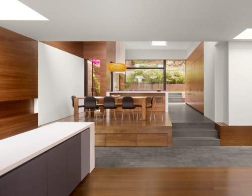
In our example, there is no wall between the dining area and the kitchen. Only a few steps distinguish the two. The establishment in levels can well define the different areas within an open plan of living. By this furnishing idea one reached also a hierarchy.
Interior design ideas for open spaces
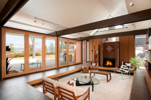
Thanks to the gradation, you can also define a small area within a larger room.
The furnishing idea in this bedroom has led to the creation of a “sunken” area. Thus one reached a quite relaxed and cozy atmosphere.
The furnishing idea in the next living room includes not only the different levels, but also several colors of the floor. Both occur simultaneously at the steps between the two, thus ensuring a smooth transition between the two areas.
If you look more closely at the interior design ideas, you will also be able to see the same kind of change in material and levels in the ceiling
Element on the ceiling
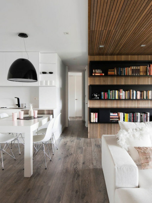
The furnishing idea in this room puts the ceiling in the center. There one observes the application of materials of different kind. The change of the building material is a very clever visual approach for the representation of the different zones. It is especially suitable for apartments with an open plan of living.
The interior design idea with the different materials on the ceiling can not be implemented in your case?
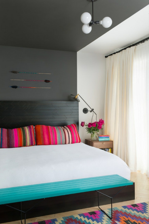
Then use bold colors for a dramatic effect. In the example here, the same color was used on the ceiling, wall and headboard. But the sharp lines delineate the sleeping area from the rest of the room. This is especially evident in front of the window next door.
Here you can see a furnishing idea for the living room, which ensures a particularly cozy atmosphere
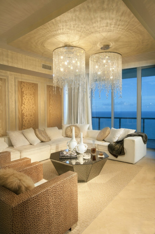
In this case, one part of the ceiling has been set lower than the rest. Using this technique, the color palette can also be consistent.
You could also add a few lights and these will make the change in heights even better. Thus, the effect of this technique will embrace the entire space.
You can also access a surprising, hanging element from the top to accentuate the change in levels
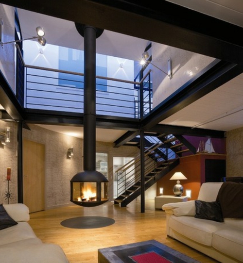
In this case, we are dealing with a floating chimney cutting through the two levels. After all, the fire pit is at the level of people sitting in the lower part of the living area. This also makes you feel more secure in a room where you could easily feel lost.
Structural elements
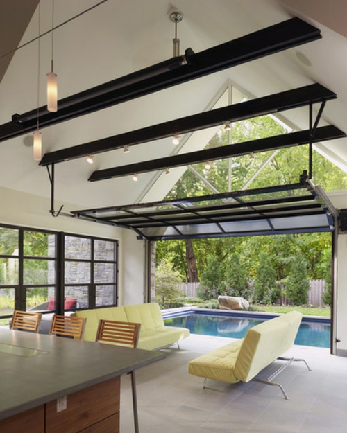
The structural design features can also be used to determine different living areas. The beams on the ceiling add an extra level of interior design, which opens under the lace ceiling.
In the houses, the exposed structural elements are often reserved for the ceiling and floor frames
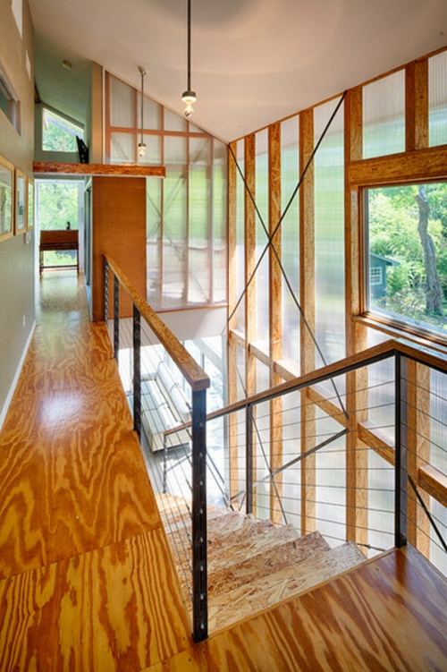
But how do you like the Cross Association in front of the transparent wall here? The walls do not always have to be solid and opaque.
Here we see steel posts with channels
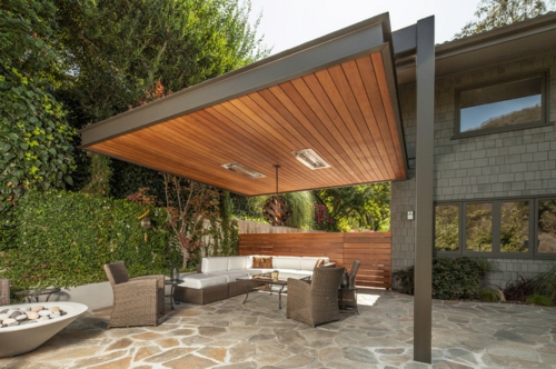
They determine the boundaries of the floating canopy, under which there is a comfortable seating area. Although this room has no walls at full height, it feels secure and closed.
Screens as furnishing ideas for the living room
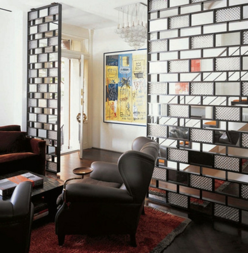
You can easily demarcate the privacy by inserting partitions. This is one of the most used interior design ideas for living rooms. This partition allows visual insight from the door into the living area.
This also creates a welcome break between the location of a person and the rest of the house.
Mixing stainless steel frame
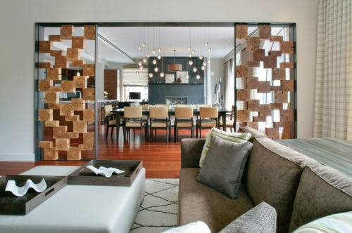
The mixing of stainless steel frames and wood blocks has contributed to the formation of a warm and contemporary use in this living room here.
The material on the ground
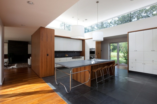
Here, the warm wood contrasts nicely with the dark, cool floor of the kitchen. At the moment one creates an optical clue in the space outline. Do you notice the parallelism in changing the shape of the ceiling and the floor?
Take the gradation of the floor in the design of the kitchen island and thus achieve a harmonious feeling
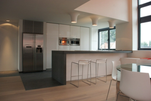
Where would the design of the room without walls look best?
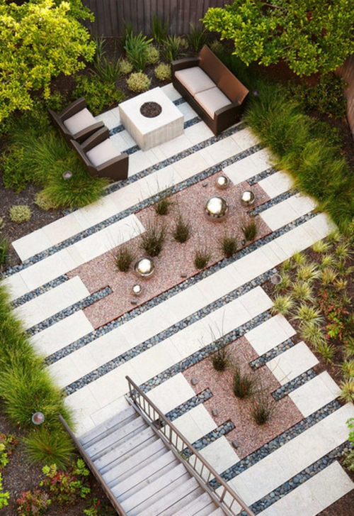
I think where there are no vertical entanglements anyway.
In this courtyard you will find an interaction of paved and landscaped areas. You can thus achieve a wonderful sense of space.
15
